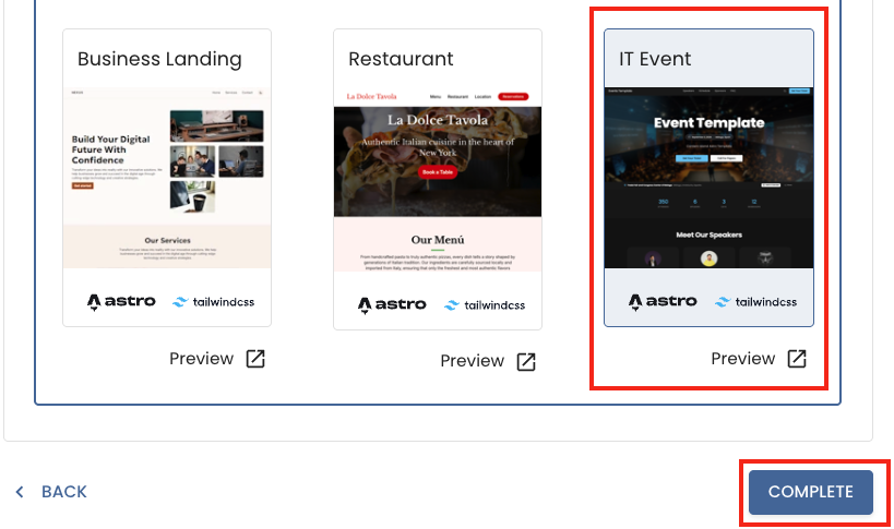
IT Event
The IT Event template is a modern, responsive event website built with Astro, Tailwind CSS, and DaisyUI, with all content designed to be managed through Content Island (headless CMS).
It’s ideal for tech conferences, meetups, and IT events that need a professional online presence — schedules, speakers, sponsors, and FAQs, all easily kept up to date without touching any code.
What’s Inside the Template?
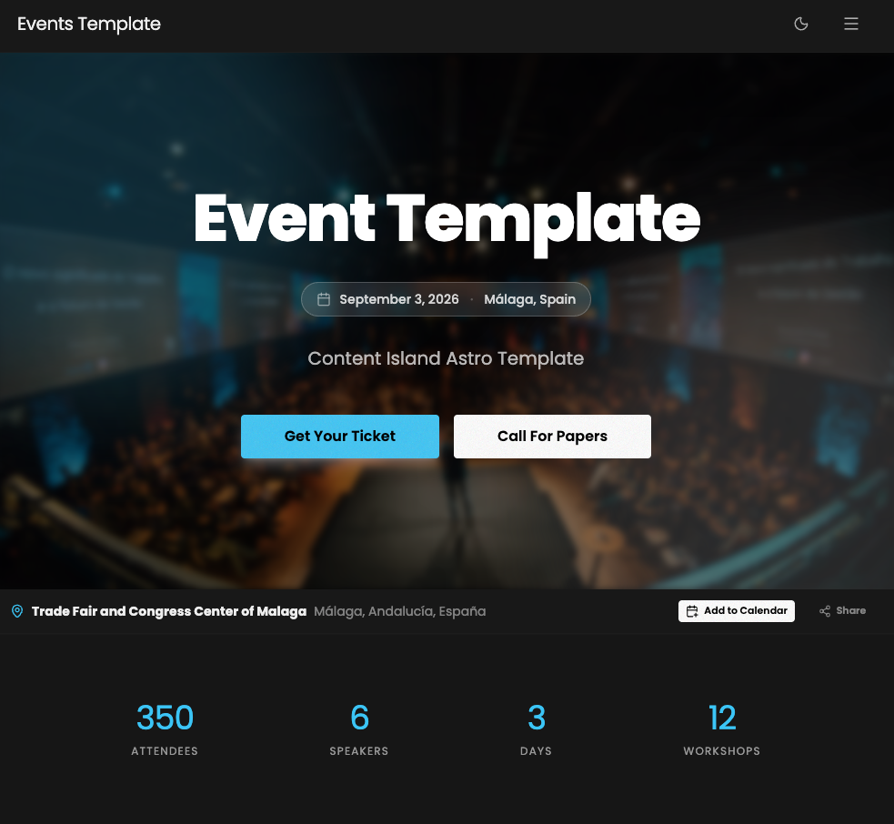
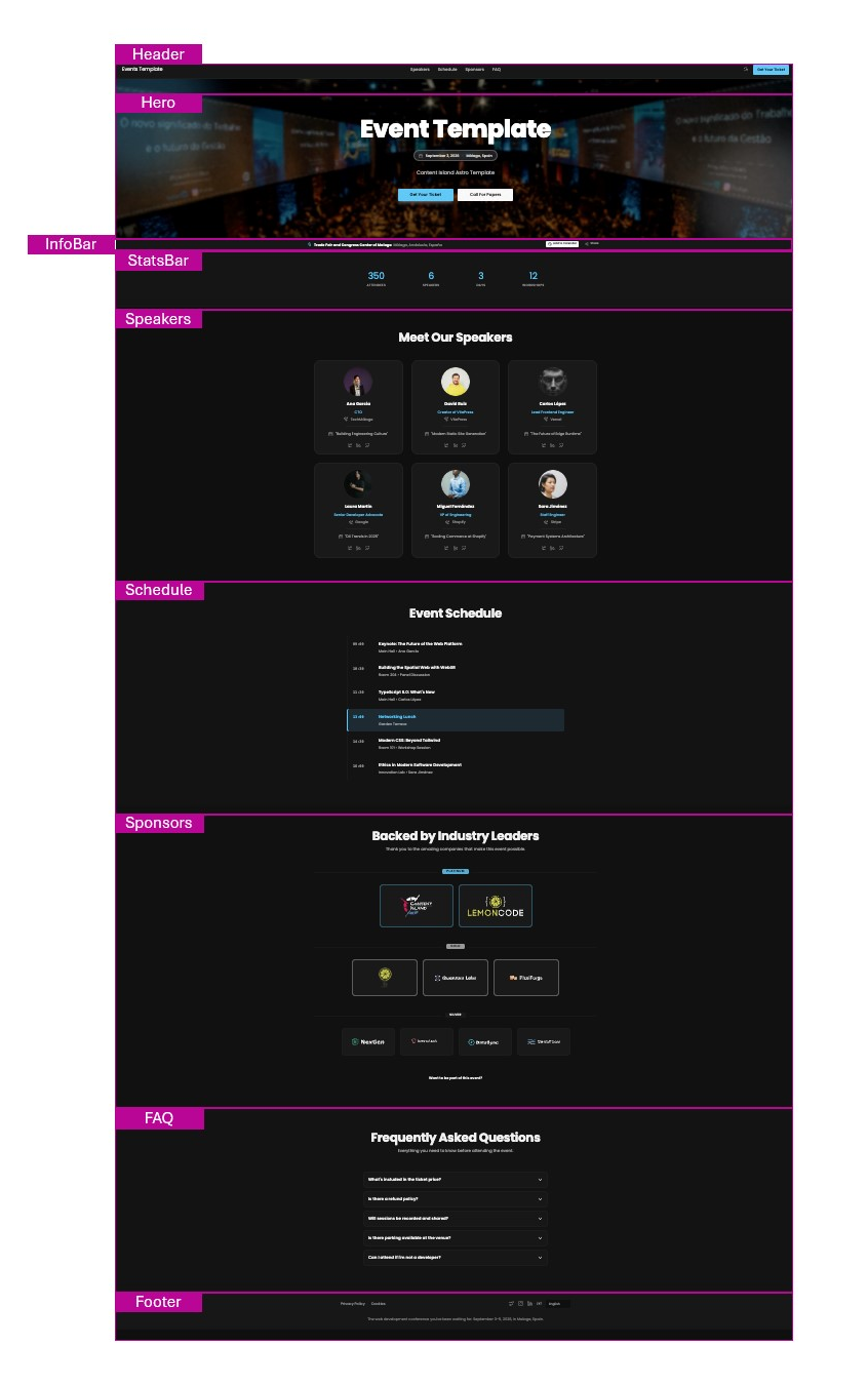
- Header: Navigation bar with event branding, main site links, and a prominent call-to-action button.
- Hero: Full-width hero section with conference background image, event name, date and location, and two call-to-action buttons.
- InfoBar: Slim information strip highlighting key event details (venue, date, format, etc.).
- StatsBar: At-a-glance statistics panel (number of attendees, speakers, tracks, sessions, etc.).
- Speakers: “Meet Our Speakers” section with speaker cards showing photo, name, role, and social links.
- Schedule: “Event Schedule” section with sessions organized by time slot.
- Sponsors: “Backed by Industry Leaders” section with sponsor logos grouped by sponsorship tier.
- FAQ: Accordion-style frequently asked questions section.
- Footer: Footer with event branding, social media links, and legal links.
- SEO-friendly setup and modern Astro project structure following the PODS pattern.
Content Mapping Guide
Each section of the IT Event template is directly linked to a type of content within Content Island.
Getting Started
- Create a new blank project in Content Island (Add Project).
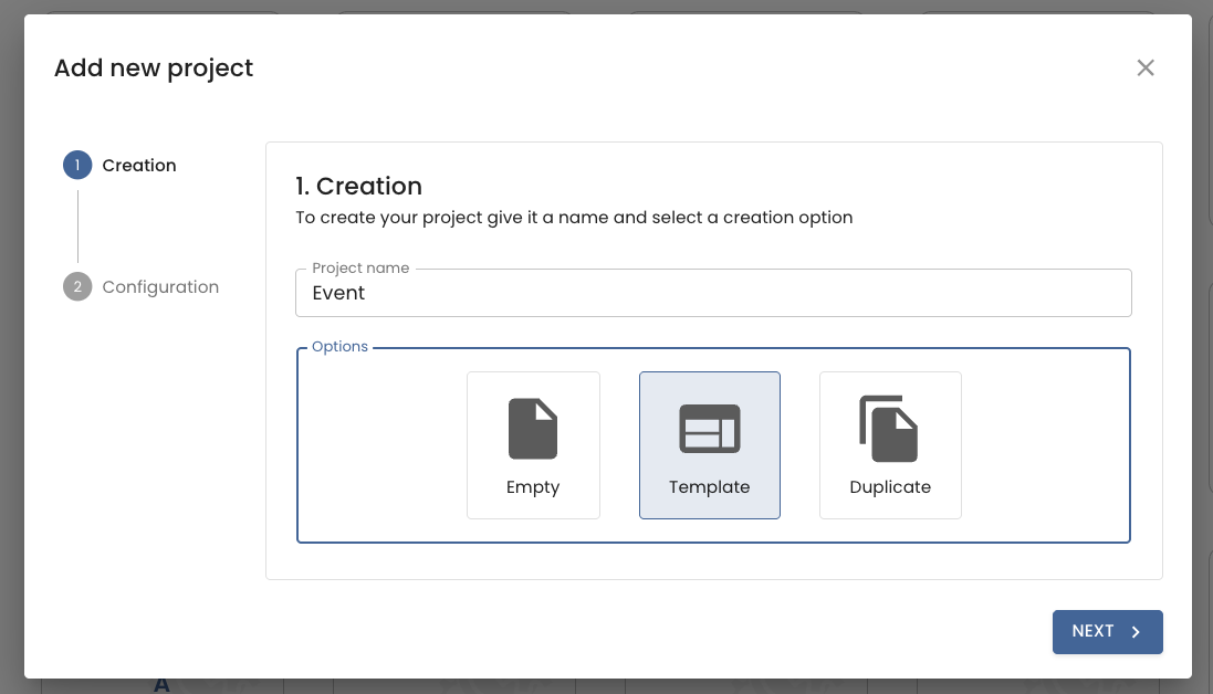
- Choose “Start from a template”.
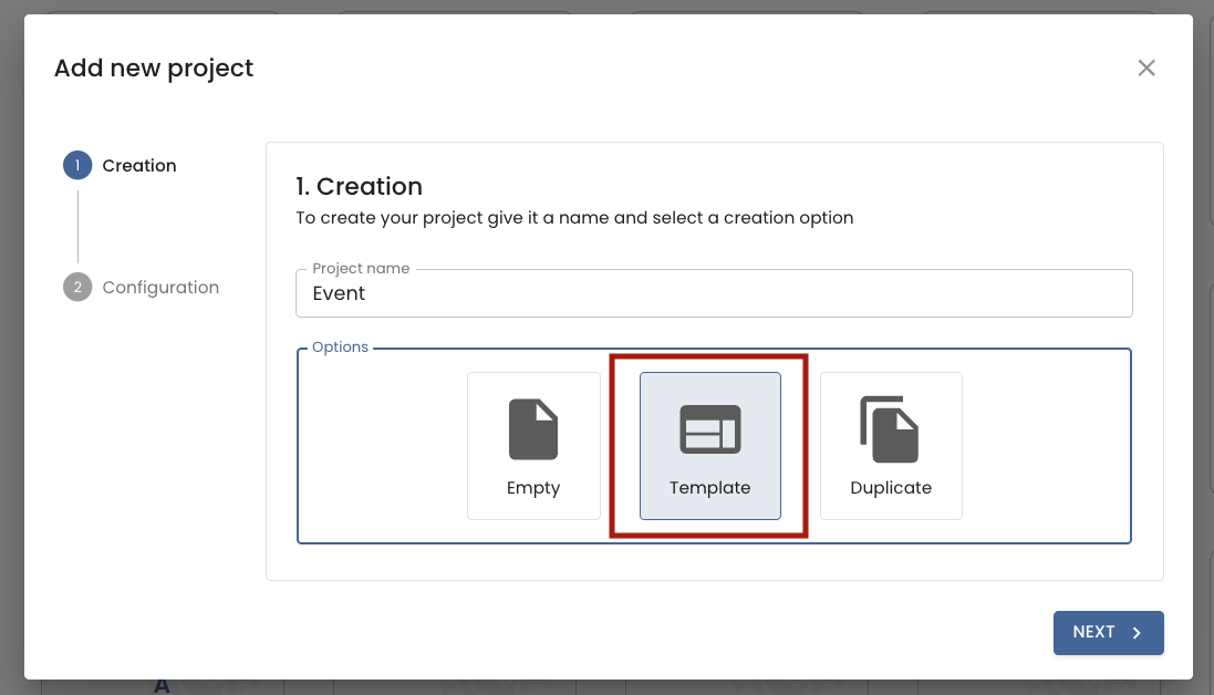
- Select the IT Event template.
- In the final step (Quick Start), copy the CLI command provided and run it in your terminal.
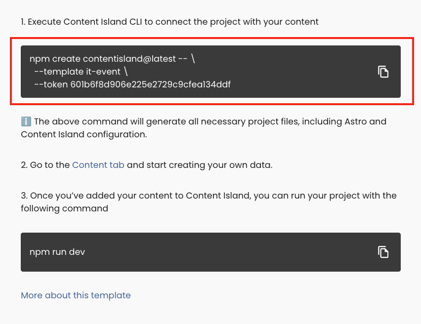
- Once created, run your local server:
npm run devTheming
The IT Event template supports two theme variants — dark and light — both fully customizable from Content Island without touching any code.
To configure the theme, go to the Content section and select the content item called Theme. There you will find two blocks, one for each variant, each with the following fields:
- Color Primary: Main accent color (buttons, links, highlights, etc.).
- Color Secondary: Secondary accent color.
- Color Background: Page background color.
- Color Surface: Surface/container background color.
- Color Card: Card component background color.
- Color Text: Main text color.
- Font Title: Typeface for headings.
- Font Body: Typeface for body text.